When most folks think of the mental health awareness symbol, they picture a green ribbon. But not many can say why green was chosen. It wasn’t decided by a committee or anything like that. The color began to gain traction in the mid-1990s when Mental Health America started handing out green ribbons as part of their awareness campaigns. Green stuck around mainly because it carried associations of hope and renewal in other health areas. It’s a bit funny how these things catch on without a clear history, right?
Interestingly, the green ribbon didn’t stay at the forefront for too long. Over the years, a bunch of other symbols popped up to speak to communities who felt the general ribbon didn’t resonate with their particular experiences. Now some of these symbols are even more recognizable to younger generations than the original ribbon itself.
Knowing the origins of each symbol is important, especially if you plan to use one in a campaign, a tattoo, or a social media post. The meaning tied to a symbol heavily relies on context. Get the context wrong, and it can miss the mark badly.
The Green Ribbon’s Accidental Path
Mental Health America, which has been around since 1909, made the green ribbon its signature mental health awareness symbol back in the 1990s. However, nailing down the exact year is trickier than expected. The organization really ramped up distribution around 1994 or 1995. Unlike many other symbols, the green ribbon doesn’t have a single founder or a unique backstory. That lack of defined origin contributes to its broad meaning: it represents mental health generally, without tying itself to any specific condition.
World Mental Health Day, created by the World Federation for Mental Health on October 10, 1992, gave the green ribbon a major platform. This event now connects advocates in over 100 countries each year, with the ribbon appearing in most official materials. Governments, hospitals, and nonprofits stick with it because it feels inclusive and doesn’t belong to any specific group.
One thing I’ve noticed is that broad symbols can be safe but feel a bit hollow emotionally. A ribbon on a lapel shows solidarity, sure, but it doesn’t share a story. That’s exactly what newer symbols aimed to provide.
Other Symbols for Specific Causes
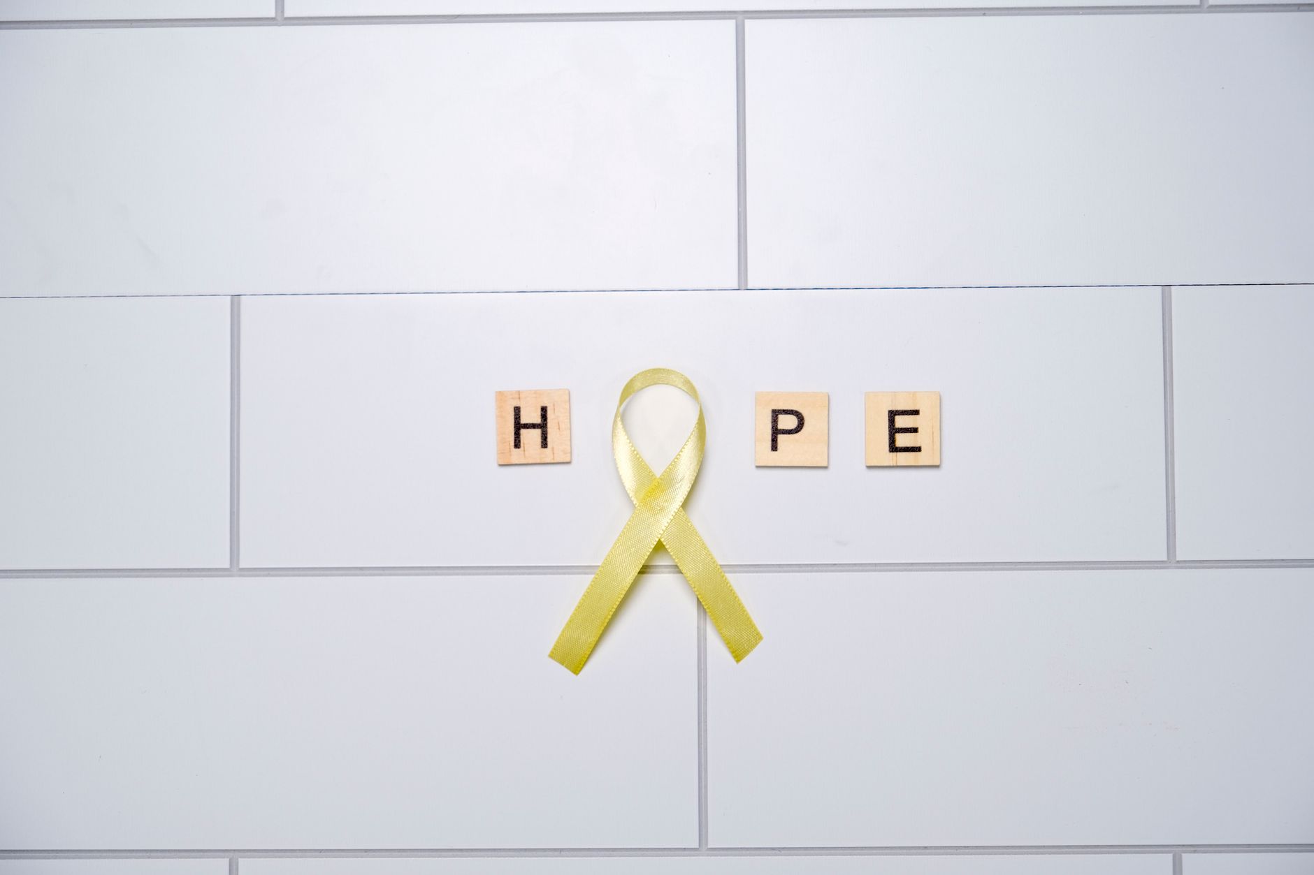
The yellow ribbon for suicide prevention came about nearly two decades before the semicolon symbol. It got its start in 1994 through the Yellow Ribbon Suicide Prevention Program in Colorado, following the tragic death of a teenager named Mike Emme. This yellow ribbon has since been used widely in schools across the U.S., Canada, and Australia. Among older demographics, it’s still regarded as the most recognized symbol for suicide prevention.
Then we saw the emergence of the Semicolon Project in 2013, founded by Amy Bleuel as a heartfelt tribute to her father, who took his life. The semicolon represents a pause rather than an end in writing: the author could have ended the sentence but decided against it. That powerful metaphor struck a chord in ways that a simple ribbon just couldn’t. In no time, the semicolon symbol spread onto wristbands, jewelry, and eventually tattoos.
Interest in semicolon tattoos skyrocketed after Bleuel passed away in 2017. That year saw a massive spike in tattoo searches, with many studios in the U.S. and U.K. reporting it as one of their most requested small designs. This symbol shifted from campaign material to something people committed to permanently on their bodies, which means a whole different level of dedication.
Meanwhile, the Bell Let’s Talk campaign started by Bell Canada in 2010 took a unique approach. It wasn’t about a physical symbol but rather built its identity around an annual social media event. For every interaction, Bell donated five cents to mental health organizations. By the mid-2010s, it had raised over $100 million CAD and driven billions of interactions. The campaign’s visual image uses blue, leading to some association of “blue for mental health”, even though blue doesn’t have the same standardization as green.
How Symbols Become Everyday Icons
A mental health awareness symbol gains traction through three main avenues: institutional endorsement, celebrity support, or grassroots community use. The green ribbon followed the institutional path, while the semicolon emerged from grassroots support. Bell Let’s Talk creatively combined institutional funds with social media strategies to create its own momentum.
What keeps a symbol alive is a specific story behind it. The semicolon works because it can be explained in one short sentence. The yellow ribbon has roots tied to a recognizable program. In contrast, the green ribbon retains its longevity mainly from institutional repetition, lacking emotional depth, which I think is a real downside worth mentioning.
If you’re crafting a campaign and deciding which mental health awareness symbol to use, think about your audience’s age and the specific issue at hand. For a general workplace setting, the green ribbon is often safe. But for suicide prevention initiatives targeting those under 35, the semicolon is usually more impactful. Yellow ribbon materials fit better in school environments where the Yellow Ribbon Program has existing connections. They’re not interchangeable, even if they all fall under the same broad umbrella.
FAQs
What color ribbon represents mental health awareness?
Green is the predominant color, officially adopted by Mental Health America in the 1990s and featured during World Mental Health Day events around the world.
What does a semicolon tattoo mean for mental health?
It symbolizes the choice to continue your story rather than end it, linked to Amy Bleuel’s Semicolon Project focused on suicide prevention and survival since 2013.
When is World Mental Health Day?
October 10 is the date, established by the World Federation for Mental Health in 1992.